Using Power BI to Understand Your Tabular Cube
Using Power BI to Understand Your Tabular Cube
Tabular cubes use advanced mashup and modeling features to combine data from multiple data sources, define metrics, and secure your data in a single, trusted tabular semantic data model. This allows for consistent reporting throughout your business and the ability to maintain security around your data. While these features are critical to developing advanced analytic models, they can also become quite complex to manage and maintain.
In the past, only technical resources have been able to provide documentation around the complex relationships, security, and metric definitions. If documentation around your Tabular cubes is not maintained (or was never created), there is no easy way for developers, QA Testers, and end users to understand their data model. This creates ambiguity for end users, leading to a heavy reliance on IT and inaccurate reporting.
In general, human error associated with manually maintaining tabular cubes documentation inevitably leads to issues down the line, not to mention the delay between deployment and documentation can also make troubleshooting very difficult. If you do not have an easy way to see how each metric was defined or calculated, how can you prove it is accurate?
A Better Way to Maintain Your Tabular Cubes
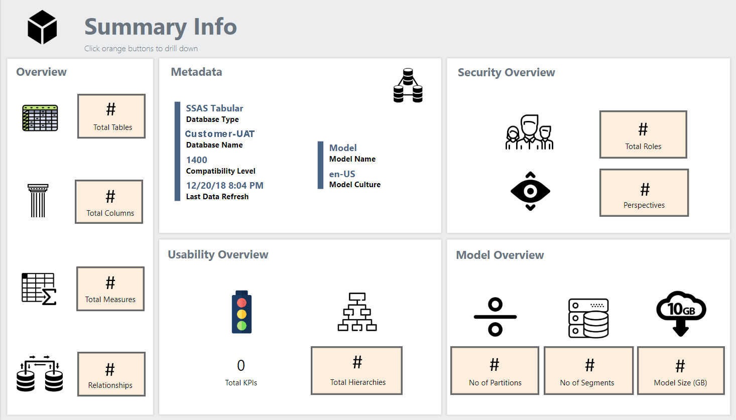
Through Power BI, you can access the Dynamic Management Views (DMVs) that return information about model objects, server operations, and server health. This enables organizations of all sizes to create detail pages on Tables, Columns, Measure, Relationships, Security, Hierarchies, and Performance Tuning. With these insights, developers, QA Testers, and end users the ability to easily access and understand live documentation around their Tabular model – no IT intervention necessary!
To test the limits on what metadata we could reach, we created a Power BI report based on this Adventure Works Model pbix file. Thus, the Tabular cube statistics report was born.
The Tabular CubE Statistics Report
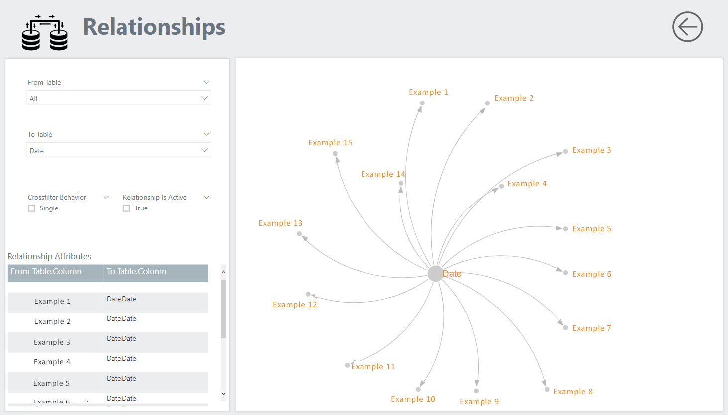
With the Tabular cube statistics report, developers, QA testers, and end users can now access a live Power BI report that will help them develop reports, troubleshoot, and manage the data model growth. For example, the Relationships page allows users to select a table and see all the related dimensions. In this example, we selected Date. Date is a common dimension to which almost every table should relate. The visual allows users to see what is related to Date, and the Relationship Attributes table displays what date is used to create this relationship.
The Calculated Columns page allows users to view the DAX expression used to create each column and the business definition for each column.
The Tabular cube statistics report has a live connection to the Tabular model. This means there is no human error around documentation or delay between deployment and documentation. This eliminates ambiguity, manually maintained documentation (costing time and may include errors), delays during testing, and lack of adoption that previous methods were prone to.
The Endless Possibilities of Power BI
Increasingly, organizations want to capitalize on all the data to which they have access by enforcing data quality standards and using data visualization and analysis tools that will help users extract meaningful insights from their data. If you’re interested in exploring how you can leverage Power BI to improve Tabular cube management, or you have another use case you’d like to explore, contact us to discuss your specific requirements and goals.

SHARE