Simplify Your Emails to Increase Conversions
Simplify Your Emails to Increase Conversions
You’ve crafted the perfect email. You’ve filled it with interesting information, included a bunch of eye-catching images, and plenty of calls-to-action, you send it into the world and… it barely leads to any conversions. So, what happened? Well, the answer to turning those conversion numbers around might just be simpler than you’d think—and the key lies in the word “simple.”
consumer habits reflect this reality.
Anecdotally speaking, it’s believable. However, the stats back it up. Globally, we consumed 79 zettabytes of data in 2021 and will likely exceed 180 zettabytes by 2025. For those doing the math, 1 zettabyte is the equivalent of one trillion gigabytes, which is a lot of zeroes.
Suffice it to say, there’s a lot of noise every marketer has to overcome. People's attention spans are shorter than ever, and they skim content rather than reading every word.
When it comes to email marketing, we have between 10 and 51 seconds to persuade our audience to take action. And while that is a wide range, it’s still an extremely short amount of time. Even when looking at Monthly Newsletters, some of the most text-heavy and varied emails in the inbox, the average user spends only 51 seconds in the email before closing it.
Why? Because we’re constantly on the receiving end of marketing content, we’ve become very fast at processing, filtering, and prioritizing information. And, this means you're not just competing with your direct competitors. You're competing with all the other content vying for your audience's time and attention, providing you with mere seconds to convince them to engage with emails.
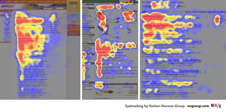
As you can see on the heatmaps above, people typically follow an "F-shaped" pattern, reading across the top of the page or email, then scanning down the left side and finally reading across again in a shorter horizontal movement.
So, what does this mean for email marketers? It means we need to simplify email designs so the most important information stands out. If readers don't immediately see something that catches their interest, they're unlikely to keep reading or engage with the content.
But what should your email designs look like? Let’s dive into some specifics.
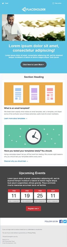
In the sample mock-up, the first (and primary) CTA is above the fold, so readers don’t have to scroll.
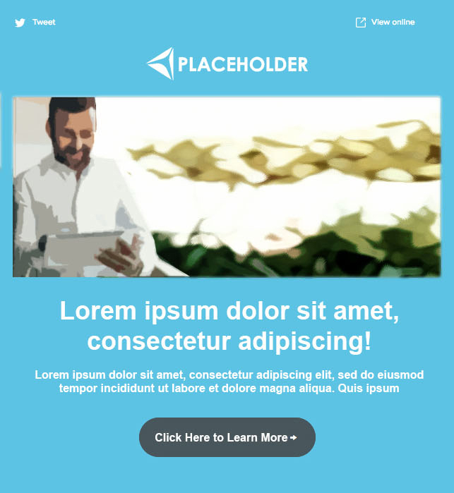
The other side of this is to focus on chunking content into visually distinguishable sections. This can mean varying section widths, breaking up sections with different color blocks, or using white space to make your emails easily scannable. The sample mockup uses each of these strategies to separate content types.
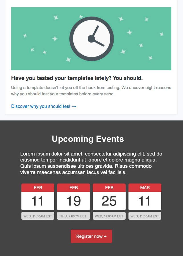
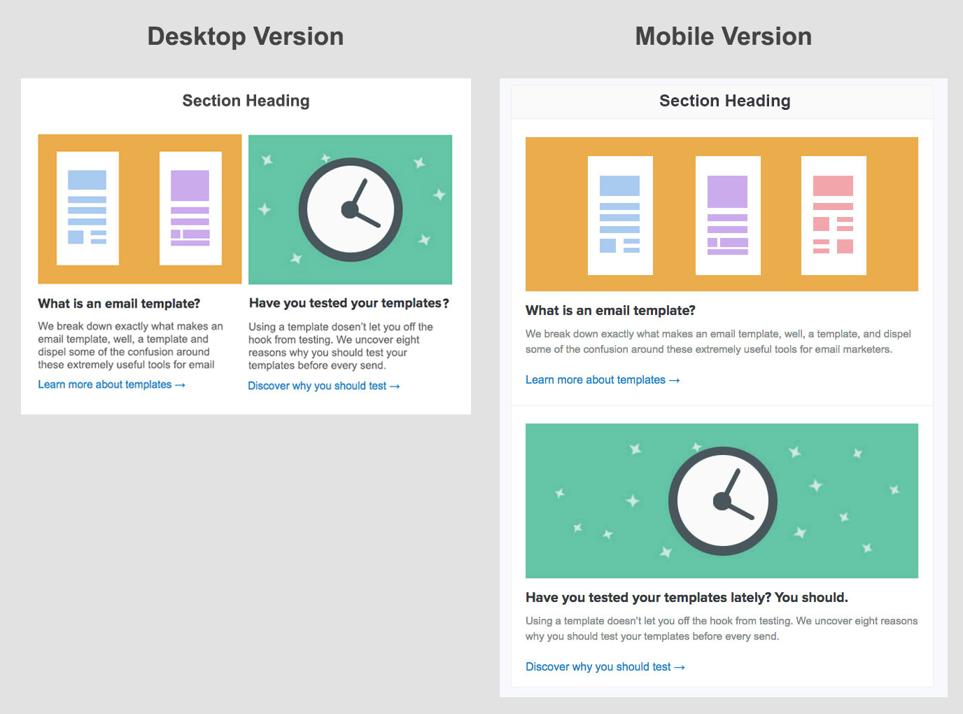
In the sample mockup, you can see how the footer is separate from the rest of the content while still organized effectively.
Email providers often filter emails based on size, so keeping your emails under 100 KB can help keep them out of the spam filter. Plus, your audience is more likely to read shorter emails all the way through, increasing the chances that they will see, understand, and act on your message.
Remember, the purpose of your email is to drive conversions, so don’t overdo it with large text-blocks or explanations. Everything in your email should highlight the calls-to-action and entice your audience to click on them.
If you need professional advice and support to make sure your emails are visually appealing, easy to read, and encourage readers to take action, my team and I can help. Contact us to learn how we can help you update your emails and increase conversion rates.
Why Simplify
It’s no secret that customers are spending less and less time on each piece of media that comes across their screen. We are well into the age of constant information bombardment, andconsumer habits reflect this reality.
Anecdotally speaking, it’s believable. However, the stats back it up. Globally, we consumed 79 zettabytes of data in 2021 and will likely exceed 180 zettabytes by 2025. For those doing the math, 1 zettabyte is the equivalent of one trillion gigabytes, which is a lot of zeroes.
Suffice it to say, there’s a lot of noise every marketer has to overcome. People's attention spans are shorter than ever, and they skim content rather than reading every word.
When it comes to email marketing, we have between 10 and 51 seconds to persuade our audience to take action. And while that is a wide range, it’s still an extremely short amount of time. Even when looking at Monthly Newsletters, some of the most text-heavy and varied emails in the inbox, the average user spends only 51 seconds in the email before closing it.
Why? Because we’re constantly on the receiving end of marketing content, we’ve become very fast at processing, filtering, and prioritizing information. And, this means you're not just competing with your direct competitors. You're competing with all the other content vying for your audience's time and attention, providing you with mere seconds to convince them to engage with emails.
A Blueprint for Higher Conversions
Eye-tracking studies offer great insights into how the average user scans through digital media. They look for headlines and images that interest them, then read a small amount of the text next to each. While it may sound disheartening, it’s actually great news! In fact, this gives us a clear blueprint for creating more engaging emails!As you can see on the heatmaps above, people typically follow an "F-shaped" pattern, reading across the top of the page or email, then scanning down the left side and finally reading across again in a shorter horizontal movement.
So, what does this mean for email marketers? It means we need to simplify email designs so the most important information stands out. If readers don't immediately see something that catches their interest, they're unlikely to keep reading or engage with the content.
But what should your email designs look like? Let’s dive into some specifics.
The Importance of Clear Design
Clear design is crucial for effective email marketing. Because you should think of your email as a targeted advertisement, design should take a top priority. Take a look at the below mock-up to illustrate some of the best practices for creating simple, effective and high-converting emails.Prioritize Clear CTAs
Your main call-to-action should be clearly visible without scrolling. Focus on one primary CTA that stands out. However, you can include as many as five CTAs if they are related.In the sample mock-up, the first (and primary) CTA is above the fold, so readers don’t have to scroll.
Delineate Between Different Types of Content
Because people rarely finish a full line of text, short sentences and paragraphs should be a top priority. You can see how short and sweet the content is in the example above. And that’s just the starting point.The other side of this is to focus on chunking content into visually distinguishable sections. This can mean varying section widths, breaking up sections with different color blocks, or using white space to make your emails easily scannable. The sample mockup uses each of these strategies to separate content types.
Font Size and Style
Make sure your body text is legible by using a minimum font size of 12-14. Most email rendering engines use Arial or Helvetica, so by sticking to them and avoiding using external web fonts, you can minimize the likelihood of your email landing in spam.Mobile Optimization
Optimize your email design for mobile devices. Test your emails on mobile devices or consider designing with a mobile-first approach in mind, using a single-column layout. Keep in mind that mobile optimization is a top priority for B2C emails, but even B2B audiences are opening emails on mobile devices. Ideally, you'll have a fully responsive template that adjusts to the device, but when in doubt, design for mobile.Distinct Footers
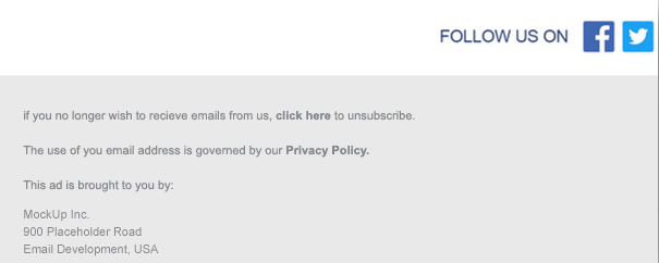
Keep your email footers small and unobtrusive. Color blocking is an effective strategy to ensure your footer doesn’t compete with your CTAs. However, legibility matters, so while you can go smaller than the body font, we don’t typically recommend a font size smaller than 10-11.In the sample mockup, you can see how the footer is separate from the rest of the content while still organized effectively.
Sharpen Your Message to Maximize Visibility
To grab and keep reader attention, a clear and concise message is critical. Below are some of the most effective ways to ensure your audience sees your message.Get to the Point Quickly
Your message should be clear and to the point. Think of it like a movie trailer: grab your audience’s attention right away so you can make sure they stay engaged.Use Bold Text Strategically
Use bold text to emphasize the first sentence of each paragraph and to highlight important headlines. This gives readers context for the rest of the text in the paragraph and helps them quickly understand the main points of your message, even when they scan.Use Short Sentences and Clear Headings
People tend to ignore large walls of text, meaning that long sentences and paragraphs are a no-go. Increasing user friction and making it harder for readers to engage is the last thing you want. Keep paragraphs and sentences short and to the point to make your emails more digestible and scan-friendly. To that end, use clear and descriptive headings and banners so readers can identify the content most interesting to them.Be Smart About Bullet Points
Bullet points make it easy for people to scan if you use them strategically. I recommend including no more than three to five bullets and keeping them short and simple.Keep it Brief
Short and sweet matters for more than sentences and paragraphs. When your whole email is short and a small file size, you can improve deliverability and increase conversions.Email providers often filter emails based on size, so keeping your emails under 100 KB can help keep them out of the spam filter. Plus, your audience is more likely to read shorter emails all the way through, increasing the chances that they will see, understand, and act on your message.
Remember, the purpose of your email is to drive conversions, so don’t overdo it with large text-blocks or explanations. Everything in your email should highlight the calls-to-action and entice your audience to click on them.
Maximizing Your Conversions Should be a Top Priority
Ultimately, simplifying your emails isn't just nice to have. It's a necessity for capturing audience attention and driving conversions. I recommend revisiting your emails and email templates regularly to ensure they live up to your expectations and those of your audience.If you need professional advice and support to make sure your emails are visually appealing, easy to read, and encourage readers to take action, my team and I can help. Contact us to learn how we can help you update your emails and increase conversion rates.
SHARE